
Thursday, October 24, 2013
How to Draw a Toucan!
Here's a step-by-step of a toucan I am working on, from my sketchbook, to an etching print. It will eventually be water colored.
Monday, August 26, 2013
TMNT Collaboration
It's a cowabunga collaboration! I was recently asked to collaborate on a coloring project by a good friend of mine, Drew Nunes. Drew is an incredible coloring artist, and chances are you have even seen his work in DC or Marvel comics, or even the work of many popular films and video games.
Drew is a close friend to me and fellow Jeb Kennedy members, Kyle Armstrong and John Spriggs, and he approached us with the idea of collaborating on a Teenage Mutant Ninja Turtles piece with line art by his friend, Mike Bwn! The Ninja Turtles provided a fun way for the four of us to collaborate on one piece, together but separately.
Each of us chose a radical turtle dude to color, and went from there. It's really fun to see our different styles of coloring, all in one piece, ranging from water color to airbrush techniques.
P.S. For those of you who don't know, I am a big TMNT fan, so this was a lot of for me. (Look below the piece to see who colored what.)

Drew Nunes- Donatello
John Spriggs- Michelangelo
Kyle Armstrong- Raphael
Kyle Blair- Leonardo
Mike Bwn!- Original Pencil Drawing
Tuesday, July 2, 2013
Not Your Mother Goose's Three Little Pigs
A while back I had the idea to do my own spin on the classic tale of The Three Little Pigs. The idea started when I was sketching pigs for the album cover I did for Bear Suit Sucker Punch, and it swam around in my head for a while until I had some free time, and I finally got around to whipping something up.
I wanted to keep enough of the characteristics from the original story to keep it recognizable, but still make it all my own. Obviously the Three Little Pigs with the wording alone, ("The first little pig..." etc.), I also kept the building tools of each pig, (hay, sticks, bricks), as well as the wolf "blowing the house down".
Anyway, you get the point. It's basically the three little pigs with a few eyebrow raises thrown in.
Oh, and I also thought it would help them feel like a set if the lines of the story rhymed when read together. I have to give a shout out to Grace Flack of the Fruitful blog for helping me think of the word "fillet" to rhyme with "hay". Girl knows food, and words. Check out her blog!
I give you pigs:

Wednesday, June 5, 2013
Noah's Book Cover
I've been working on a book with a great author out of South Africa, and I just did some work on a cover. Thought this was a good example of how an idea starts small before it is finished. Sometimes I will do a number of tiny sketches before deciding to turn one into a finished product. Other times, I like the first sketch enough to just go with it, (though that probably isn't the best advice).
Off to the left side you can see the edge of another roughly sketched idea that I decided to pass on, (it involved a clock tower).


Off to the left side you can see the edge of another roughly sketched idea that I decided to pass on, (it involved a clock tower).


Thursday, May 30, 2013
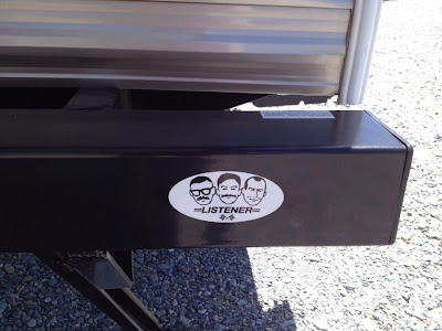
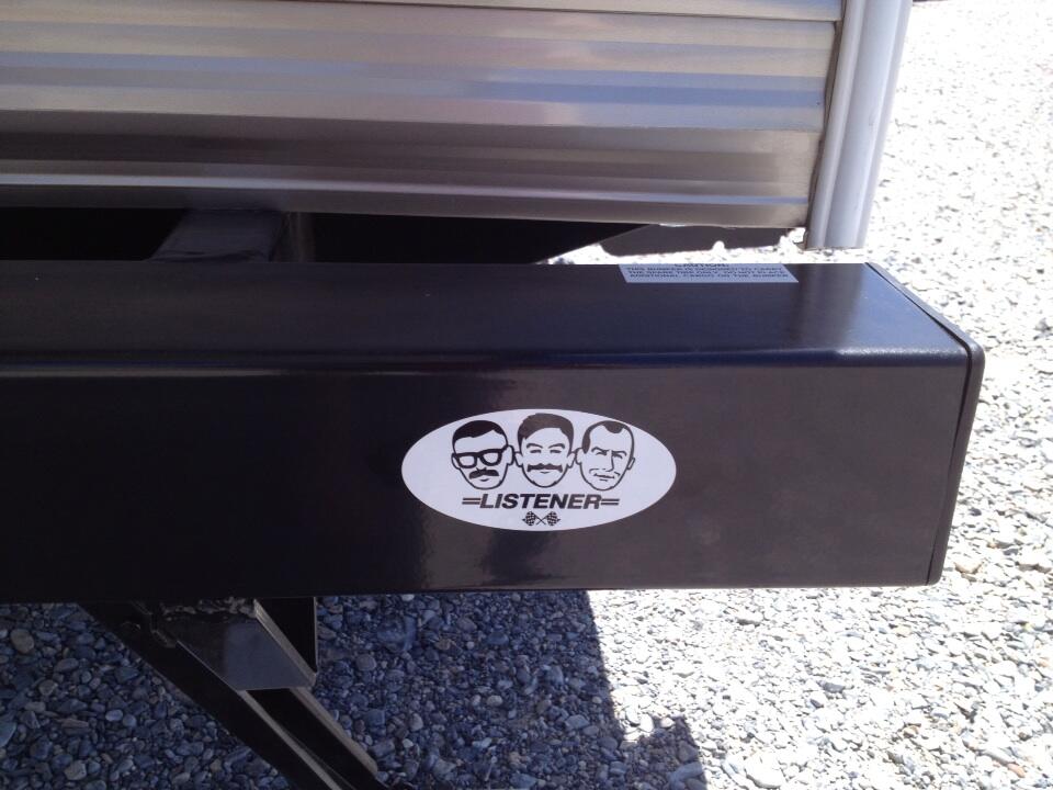
Listener Band Sticker
I was recently asked by the frontman of the band Listener, Dan Smith, to design a new sticker for their upcoming tour. The band has recently grown to three members, and he asked if I could do a spoof on the popular Pep Boys logo, with the faces resembling the three band members.
I met Dan a number of years ago, and love every chance I get to work with him. Listener has a new album, Time is a Machine, coming out very soon, so keep an eye out on this website for tour dates and release dates:
http://iamlistener.com/
This is a very talented group of guys.

I met Dan a number of years ago, and love every chance I get to work with him. Listener has a new album, Time is a Machine, coming out very soon, so keep an eye out on this website for tour dates and release dates:
http://iamlistener.com/
This is a very talented group of guys.

P.S. Here is a recent photo tweeted by the Listener guys, of a one-color version of the sticker in use!
Knit Together Photography
Here's a recent logo I did for a couple in South Africa, Brent and Nicola, that are starting their own wedding photography business. I had the pleasure of becoming friends with Brent during my S'African trip last Summer. He let my friends and me crash at his place in Cape Town for a week, and was a better tour guide than we could have possibly asked for. He showed us one of the best weeks of our lives, and Cape Town and Brent have a special place in my heart.
Brent and Nicola are setting up a website for the business now, and from what I have seen of their photography, they are going to take the scene by storm.

Brent and Nicola are setting up a website for the business now, and from what I have seen of their photography, they are going to take the scene by storm.
Saturday, May 4, 2013
Grey Bird Design
Here's a recent logo I made for a super cool friend of mine in South Africa. It was a nice time working on this logo. A fan of my work, he wanted to leave the design up to me. To get my inspiration flowing, he told me he was a big fan of traditional archery and printmaking, and I already knew that he was a fan of my hand lettering, specifically my "Thank Ya Kindly" design.
Combining the feel of the cursive-hand-written-script style of 'Thank Ya Kindly", printmaking, and archery, plus the name "Grey Bird Design", produced the logo below. Lots of fun.


Combining the feel of the cursive-hand-written-script style of 'Thank Ya Kindly", printmaking, and archery, plus the name "Grey Bird Design", produced the logo below. Lots of fun.

I also wanted to provide a black and white version of the logo. This will come in handy any time he needs to print one-color, or make a water mark or engraving.

Here is sort of a primitive step-by-step process of how I came about drawing and designing the type for the logo. First step is a pencil sketch, second step is inking the type by hand, third is making a vector drawing of the type in Illustrator, and finally sprucing it up in Photoshop.

And finally, here is look into the process of making the wee bird:
The Softer Side of Jeb Kennedy
For the month of April, my illustration group, Jeb Kennedy, hosted a theme month dedicated to women. Exactly one month after the actual National Women's Month, we hoped we could squeak by without anyone noticing. It took about one day for someone to notice.
The idea was to stretch ourselves mostly. The four of us, (all being gentlemen), haven't spent as much time practicing drawing the female form as we'd like. So, hoping to boost our confidence with drawing women, and add some to our portfolios, we set off to do the unthinkable- draw ladies for a month.
The results were a lot of fun, and we were even privileged enough to receive some guest art from some very talented female illustrators. Lots of fun. I now feel almost experienced enough to actually hold a conversation with a real lady!
Below are my submissions for Ladies & Jebs. If you'd like to see all the lady art from the other guys, and the wonderful guest submissions, please check out the Jeb site at:
http://www.jebkennedy.blogspot.com/
Enjoy!
These first two nautical-themed illustrations were a lot of fun. I plan on adding to the series with at least a third piece taking place at night. If I'm feeling ambitious, I may do a fourth installment taking place at sunrise.

I'm very pleased with this entire whale illustration. One of those stellar times when the image in my head is perfectly translated through my hands an into an illustration. A really great feeling.

This mermaid illustration is the second in the ocean series. It was really fun playing with different color combinations to get the feeling of dusk. I also really enjoyed drawing the different sea life in this series, and giving each sea creature it's own little personality. The idea is that the moon is a a little teaser of the planned third installment for the series.

When working with a retro/mid-century style, and drawing women, it is almost a requirement to draw a pin-up-style lady riding a rocket or a bomb. I will also take any excuse to draw anything outer-space-themed. I thought maybe putting her side-saddle would by more lady-like. This paragraph as a lot of hyphenated words.

I really wanted to do a piece that broadened the definition of our "lady" theme, by doing a little lady. Once I made my mind up to doing an illustration of a little girl, it didn't take long to decide on Boo from my very favorite Pixar film, Monsters Inc. The relationship between Sulley and Boo is really fun to watch progress throughout the movie, and I really wanted to show how she can make this otherwise terrifying beast into an innocent playmate. This one was one of my most well-recieved illustrations in Ladies & Jebs, and super fun to make. It sorta just came together very naturally. (It was also a ton of fun to sneak in all of the hidden, Pixar-style, easter eggs into the illustration.)
Hope you enjoyed the lady art! I promise, from now on it will not take me being forced to add a female touch to my work now and then.
Sunday, April 7, 2013
Bear Suit Sucker Punch Album Art
I recently did some album art for my good friends in the band, Bear Suit Sucker Punch, and their new single, "March of the Pigs". I've been friends with these guys a long time, and love their music. Plus, it was a good way to return the favor for their first-rate recording of "The 12 Days of Jebmas" last December.
Check out this link for a pay-what-you-want download of the single. If you like punk rock, you'll love BSSP. If you don't like punk rock, BSSP will hold your hand and show you the way.
http://bearsuitsuckerpunch.bandcamp.com/album/march-of-the-pigs-single
Here's the cover, and below is some behind-the-scenes bonus features: a little taste of the pig character, "Fance E. Pigg", by himself, as well as my first sketch of him.
Oink!

Bonus Features:


Sunday, March 31, 2013
Thank You Cards Update
Here are some photos of the letterpressed version of the thank you card I designed recently for Natalie Slater. Natalie printed each card by hand at a printing press in Tulsa, and I'm pleased that they turned out so well. You can pick up a card at her gallery show, The Mother Road Revisited, in Tulsa, OK on April 5th. Otherwise, we will be making the cards available for purchase online somehow, after the show.
-Kyle
x o x o


-Kyle
x o x o


Tuesday, February 5, 2013
Thank You Card Type
Recently, I was commissioned by Natalie Slater to design some hand lettering for a thank you card she plans on giving to those who have helped with her upcoming gallery show in April. We will also be selling the thank you cards at the show, so if you are in the area you can pick one up! I've talked a lot about Natalie's show, Mother Road Revisited, in previous posts, but if you are unfamiliar with the project, make sure to follow the link to the website for info. You can attend the show opening in Tulsa, Oklahoma on April 5th!
Below is the type as it is now digitally, though for the actual final cards it will be letterpressed.


Below is the type as it is now digitally, though for the actual final cards it will be letterpressed.

Behind the scenes special feature:
Subscribe to:
Posts (Atom)